6. Charts
Charts allow us to represent the data from queries in a visual way.
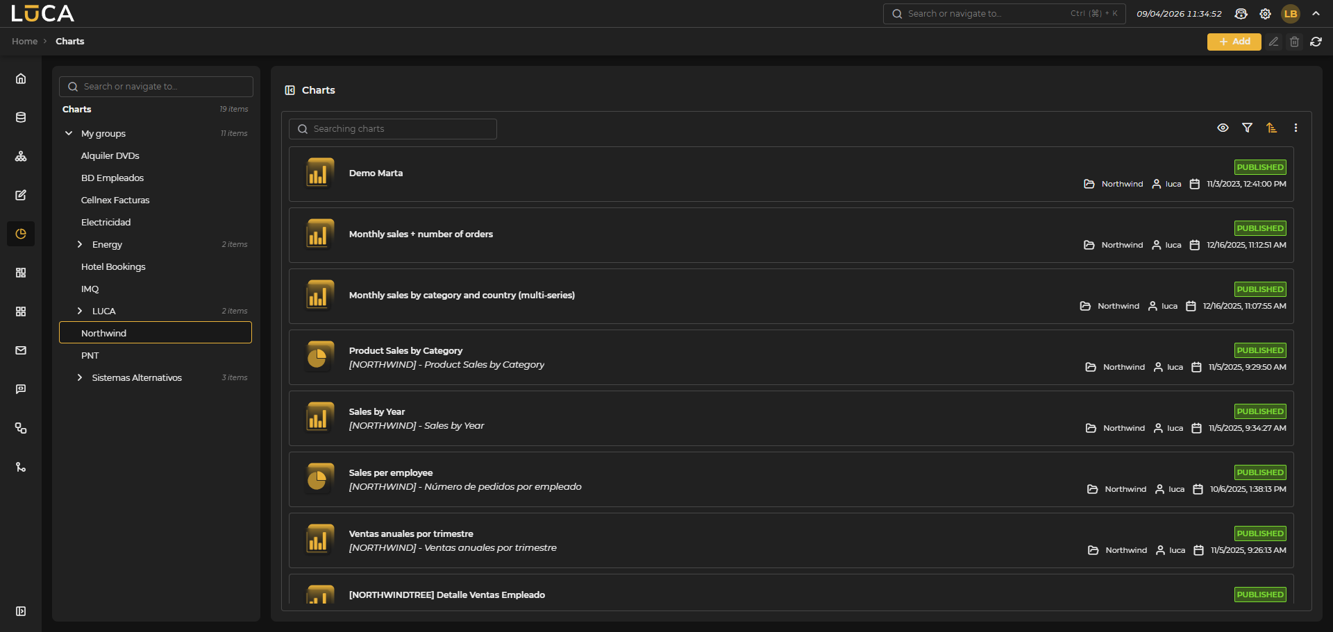 Figure 6.1: Chart Management
For more information about the general management screen, see this section.
Chart Creation and Editing
In the chart creation view, we find the following structure:
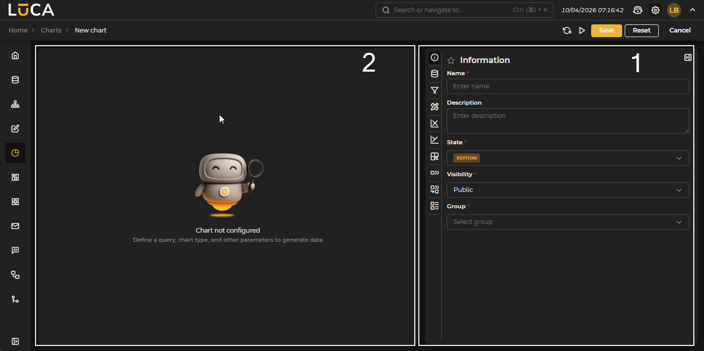 Figure 6.2: Chart Creation
Configuration (1): Configuration menus for chart options.
Preview (2): Preview of the chart.
In the configuration section, we find the following buttons:
- Reload: Executes the chart within the configuration panel, offering a preview of the result.
- Execution: Saves and executes the chart.
- Save: Saves the chart information.
- Reset: Clears the data entered in the form.
- Cancel: Closes the editor and returns to the chart management screen.
Information
This configuration is shared by all LUCA elements. For more information, go to Information tab.
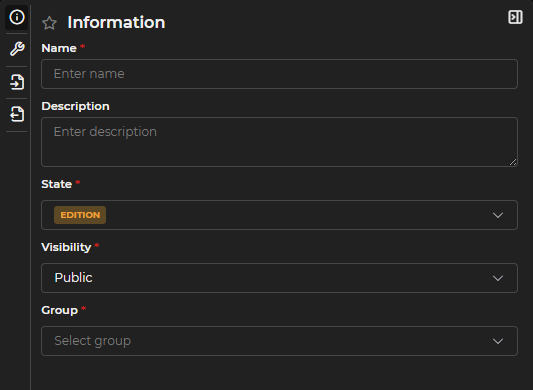
Figure 6.3: Information Form
Query and Type Configuration
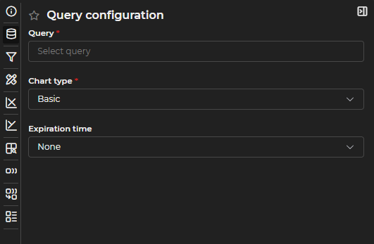
Figure 6.4: Query Configuration Form
In this section, the following elements can be configured:
Query: You can choose from all queries you have permissions for that are in a Published state.
Chart Type:
- Lines, columns, areas, or markers: Basic charts where line, column, area, or marker series can be mixed interchangeably.
- Pie: Pie or donut type charts.
- Heatmap: Heatmap type charts.
- Gauge: Gauge or indicator type charts.
- Pivot Table: Collapsible and grouped table type charts.
- Scatter: Scatter or bubble charts.
- Simple: Simple charts of a single value.
- Html: Charts where HTML code can be developed to represent data in a customized way.
- Map: Map type charts to represent coordinates.
Cache Time: You can define how long the data will remain cached.
Unlike query caching, chart caching only stores aggregated data, not the complete dataset.
You can open the editing of the query associated with the chart by clicking the link button next to the gear.
Filters
At least one default filter must be set, as every chart in LUCA must have at least one. To do this, you need to assign a name, toggle the Apply by default switch, fill in the necessary input values, and click on Add Filter.
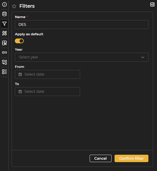
Figure 6.5: Filters Form
It is necessary to click the Add Filter button to save the configuration.
Container Configuration
This section allows the definition of the following elements:
- Title: size, color, and font style.
- Caption: size, color, and font style.
- Container: background color and margins of the chart.
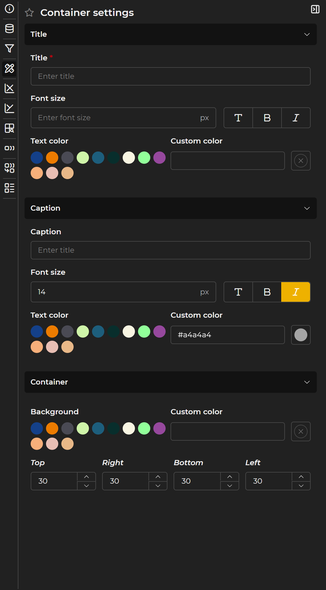
Figure 6.6: Title and Subtitle Form
For titles and subtitles, you can choose the font style (normal, bold, or italic), in addition to color and size.
LUCA automatically applies default margins to the charts, but these can be customized if necessary to adjust the visualization.
Legend
The legend configuration is available in basic, pie, heatmap, and scatter type charts.
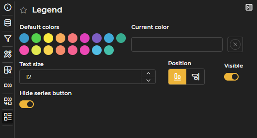
Figure 6.7: Legend Configuration
You can define the following elements:
- Color of the legend text.
- Size of the text.
- Visibility of the legend.
- Position: right or bottom.
- Hide series button: In basic and pie charts, enables a button to hide all series at once. Once hidden, the button switches to show all series.
Specific Configurations
The specific configurations for each type of chart are described below, detailing those aspects that are not common to all types.
Basic
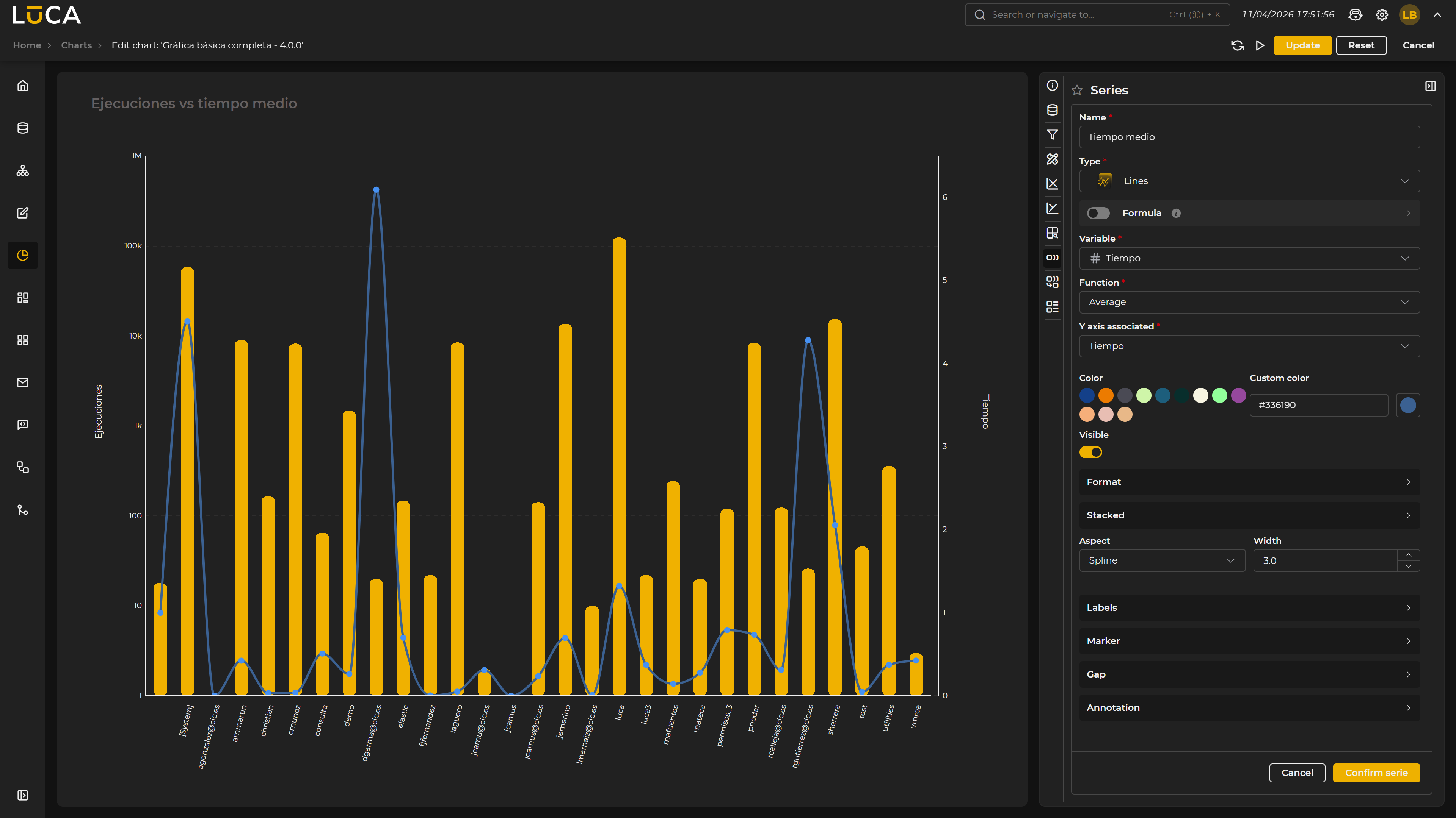 Figure 6.8: Basic Chart
Basic charts, in addition to the menus described earlier, have the following configuration options.
X-Axis
This configuration is also available for any chart with axes.
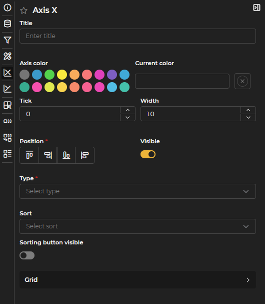
Figure 6.9: X-Axis Configuration
The following properties can be defined:
- Name of the axis.
- Color.
- Tick size or lines that mark the different values of the scale.
- Width of the axis.
- Position: top, bottom, left, or right.
- Visibility of the axis.
- Axis type: categorical, date (for temporal axes), linear or logarithmic.
- Order: ascending or descending for each of the axes.
- Series used in the sorting.
- Visibility of the sorting button: located in the upper right corner of the chart, allows access to the available sorting options.
- Grid or background mesh that helps read the values of the chart. You can configure the color, width, opacity, and type (solid, dashed, or dotted).
The Order, Series, and Visibility of the sorting button options are only available when zoom is disabled in the category configuration. Additionally, Series requires that the category be of type date.
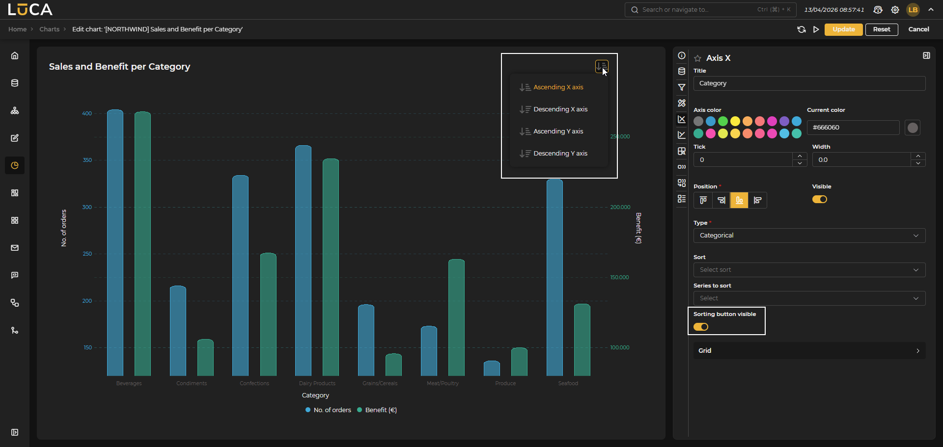 Figure 6.10: Sorting Button
Y-Axis
The basic configuration of the Y axis is the same as that of the X axis, with the difference that it allows the creation of multiple axes and the configuration of min, max, asymptotes, and ranges.
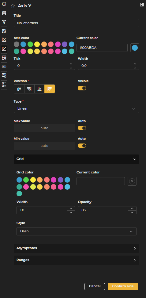
Figure 6.11: Y-Axis Configuration
- Asymptotes Lines located at a specific value of the axis. You can define title, color, width, position value, and type.
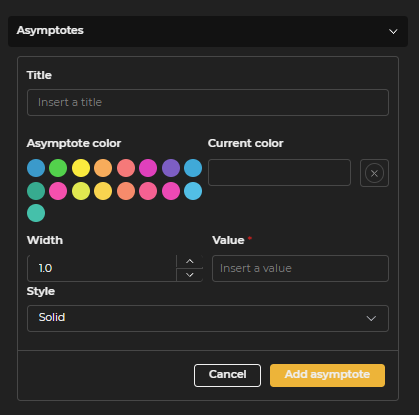
Figure 6.12: Asymptotes Configuration
- Ranges Stripes between two values marked by a filled rectangle with opacity to quickly visualize if there is any value in between. You can define title, color, opacity, and min and max values.
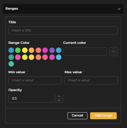
Figure 6.13: Ranges Configuration
Categories
Categories represent the elements by which the data to be visualized is grouped. In charts with axes, the category corresponds to the X axis. This is defined by selecting the corresponding variable.

Figure 6.14: Categories Configuration
For Date type variables, you can choose the applicable grouping type. For example, to group data monthly, the option Month of the year (MM/yyyy) is selected.
 Figure 6.15: Chart with Date Variable
For date type variables, you can also enable the zoom option, allowing navigation along the time axis.
 Figure 6.16: Chart with Date Variable and Time Series
Series
Series represent the data to be visualized and their presentation format. One or multiple series can be configured per chart.
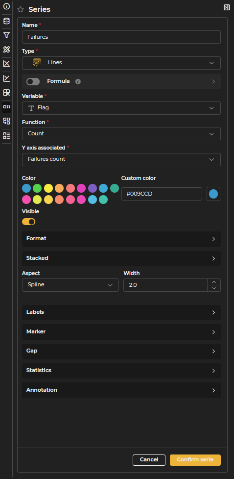
Figure 6.17: Series Configuration
For each series, you can configure the following properties. The availability of some options will depend on the type of series and the selected X axis type:
- Name: Identifier of the series that will be displayed in the legend and tooltips when hovering over the data.
- Type: Visual representation style of the series. It can be line, column, area, or marker in the case of basic charts.
- Formula: Instead of directly using a variable from the query, you can define a mathematical formula using other variables to dynamically calculate the values of the chart.
- Variable: Field in the query that contains the data to be represented. This field will not be visible if the series uses a formula.
- Function: Aggregate operation applied to the data (sum, max, min, average, count, etc.).
- Associated Y Axis: Y Axis with which the series is related.
- Color: Main color of the series.
- Custom Color: Allows the definition of a specific color with a selector.
- Visible: Allows deciding whether the series is visible or not.
- Format: Formatting options for the numerical values of the series.
- Prefix and Suffix: Texts added before or after the numerical value (for example, €, %, etc.).
- Maximum and Minimum decimals: Controls the number of decimals to display.
- Thousands separator: Activates or deactivates the thousands separator (for example, 1.000 or 1000).
- Shorten: Reduces large numbers to compact format (for example, 1.5K instead of 1500).
- Stacked: Allows adding an additional variable to group the data of the series.
- Appearance: Visual style of interpolation for line or area series. It can be curved (smoothed), straight (linear), or step (stepped).
- Width: Thickness of the line in pixels.
- Border
- Border color: Color of the outline for column or area type charts.
- Custom border color: Selector to define a specific border color.
- Border width: Thickness of the border of the column in pixels.
- Border radius: (bar type)
- Opacity: Level of transparency of the fill of the column or area (0 = transparent, 1 = opaque).
- Marker (Marker Series)
- Icon: Shape of the marker in marker type series. It can be circle, square, triangle, cross, star, or diamond.
- Height: Vertical position where the marker icon will appear.
- Icon size: Dimensions of the icon in pixels for marker type series.
- Line width: Width of the marker's contour in pixels.
- Marker (Line or Area Series)
- Radius: Size of the circular marker in pixels.
- Border width: Thickness of the outline of the marker.
- Color: Main color of the marker.
- Custom color: Selector to define a specific color for the marker.
- Border color: Color of the outline of the marker.
- Custom border color: Selector to define a specific color for the border.
- Visible: Controls whether the markers are visible or hidden.
- Labels: Text displayed at each data point. You can configure their visibility, size, color, and orientation.
- Size: Size of the label text in pixels.
- Orientation: Orientation of the label text (vertical or horizontal).
- Color: Color of the label text.
- Custom color: Allows defining a specific color with a color selector.
- Visible: Controls the visibility of the labels at the data points.
- Gaps: In line and area series, you can configure how missing values in the data are displayed.
- Color: Color of the line that represents missing values.
- Custom color: Allows defining a specific color with a color selector.
- Width: Thickness of the line that represents gaps in pixels.
- Opacity: Level of transparency of the gap line (0 = transparent, 1 = opaque).
- Type: Line style to represent the gaps. It can be dots, dashes, or solid.
- Visible: Controls whether the gap line is displayed or left blank.
- Statistics: A set of mathematical tools that offer the possibility of adding advanced analysis indicators to the charts (moving averages, deviation bands, predictions, etc.). Currently available mainly in line charts. See complete details in the section Statistics.
- Annotations: Special markers that allow automatically highlighting the maximum or minimum values of a series in line and area charts.
- Type: Defines which values will be marked with annotations. It can be maximum value, minimum value, or both.
- Opacity: Level of transparency of the annotation marker (0 = transparent, 1 = opaque).
- Label: Text that will be displayed in the annotation next to the marked point.
- Size: Size of the label text in pixels.
- Background color: Color of the background of the annotation marker.
- Custom background color: Selector to define a specific background color.
- Text color: Color of the text in the annotation label.
- Custom text color: Selector to define a specific text color.
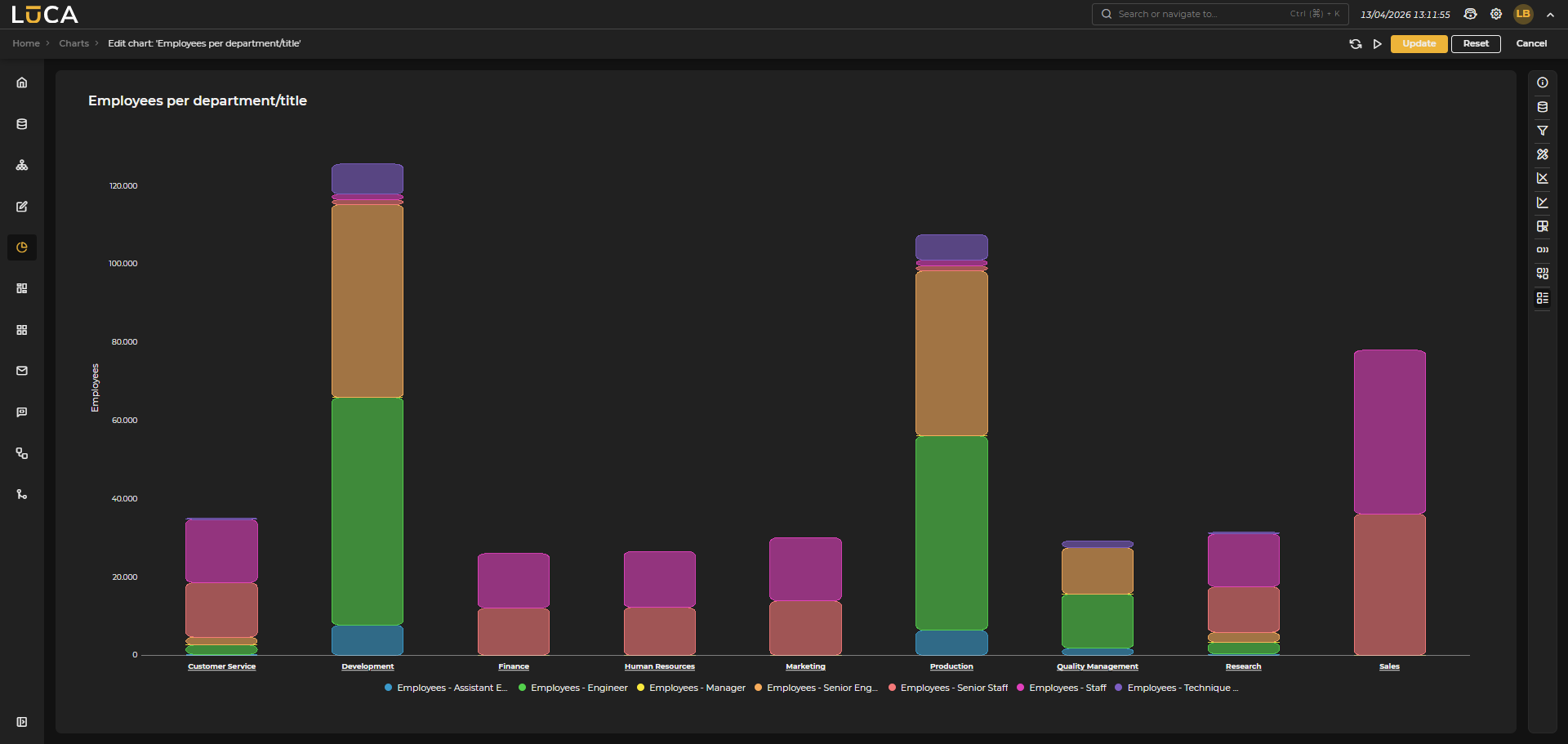 Figure 6.18: Stacked Series Chart
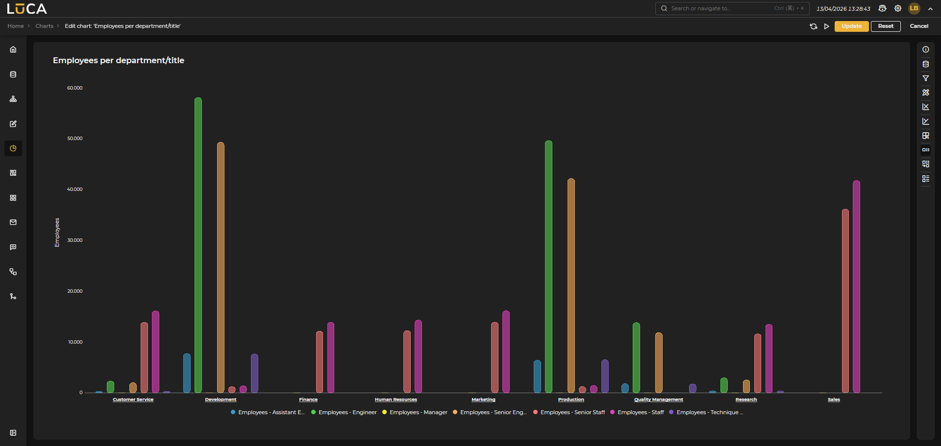 Figure 6.19: Grouped Series Chart
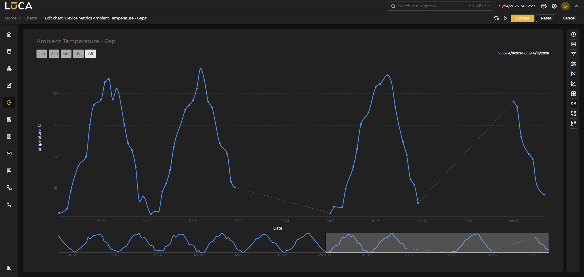 Figure 6.20: Gap Chart
Column type series cannot be used when dealing with time series.
Marker type series can only be used when dealing with time series.
Drilldown
Drilldown allows navigating deeper into the data. One or multiple drilldown levels can be optionally added, where you can declare the category to group by and the series you want to visualize at each level.
 Figure 6.21: Drilldown Chart
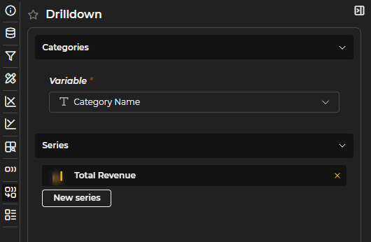
Figure 6.22: Drilldown Configuration
Statistics
For statistical analysis, the following tools are available:

Figure 6.23: Statistics
- Calculate over selector: Allows selecting whether calculations apply to the main series, the prediction, or both.
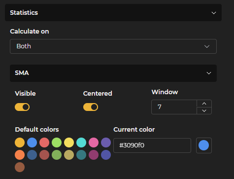
Figure 6.24: SMA
- SMA – Simple Moving Average: The average of a set of values over a Time Window. It helps to smooth out the data and view trends without too much “noise”. Image: Average of the last 7 values (measured variable). You can also select the color and center it.

Figure 6.25: EMA
- EMA – Exponential Moving Average: Similar to the SMA, but gives more weight to recent values. It reacts faster to changes. Example: If today’s data increases significantly, the EMA reflects this sooner than the SMA. The Alpha value helps determine how much weight is given to the most recent data compared to previous ones.

Figure 6.26: TMA
- TMA – Triangular Moving Average: An average that is calculated twice: first an SMA and then another on the result. Thus, the central values of the series weigh more, and the curve becomes even smoother. It is used when you require a very "clean" and stable line. The Window is the number of data points used in each average calculation.
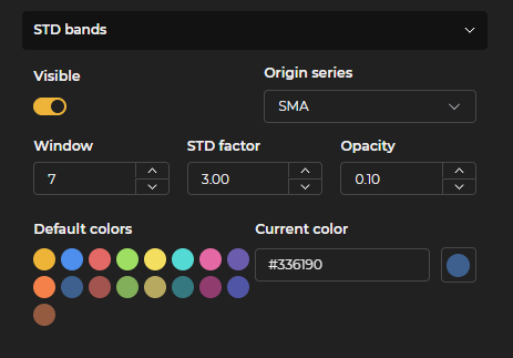
Figure 6.27: STD
- STD Bands - Standard Deviation Bands: Based on the mean and how the data disperses around it. It is calculated on a central line (Original Series on which it is applied) and shows two bands above/below at a certain standard deviation, corresponding to the calculation between the Window and the STD Factor. They serve to see whether a value is “within normal” or deviates too much.
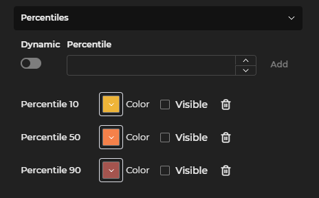
Figure 6.28: Percentiles
- Percentiles - Divide a set of data into 100 parts. They indicate the relative position of a value within the group. Example: if a value is in the 90th percentile, it means it is greater than 90% of the other data. They can be made dynamic, with as many as needed, and colors can be modified.
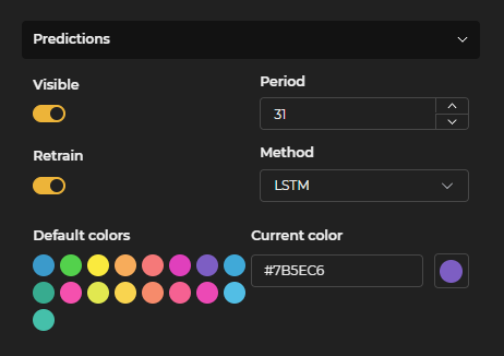
Figure 6.29: Predictions
- Predictions - These are estimates of future values based on historical data. Statistical models are used for this. The tool provides a list of 5 models. Period is the temporal value used for the calculation.
These are the available models, with a brief description:
- ARIMA → Classic statistical model.
- Holt-Winters → Seasonality and trend.
- Prophet → Easy predictions with seasonality and holidays.
- LSTM → Neural network for long series.
- GRU → Simpler and faster version of LSTM.
For models that support it (LSTM and GRU), a Retrain switch is available that forces the model to recalculate using the most recent data.
Pie
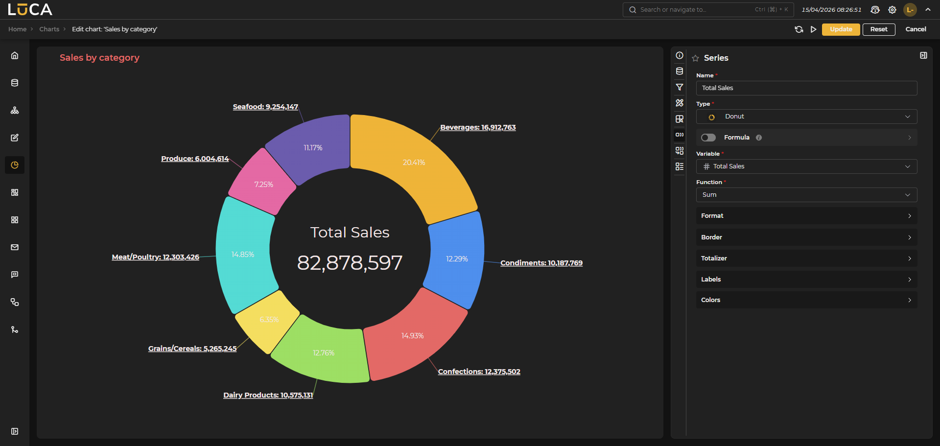 Figure 6.30: Donut Chart
In pie charts, you can choose between two types of series: pie or donut. Just like in basic charts, you need to specify a category and a series. Additionally, you can configure as many levels of drilldown as desired.
Unlike basic charts, pie type charts can only have a single series.
Pie
In pie type series, besides the basic configuration shared by all series, you can configure the following specific options:
- Border: Show the percentage that each slice occupies. When this option is enabled, an additional switch is activated that allows placing the percentage inside the chart.
- Colors: Allows selecting a Category and assigning it a specific color.
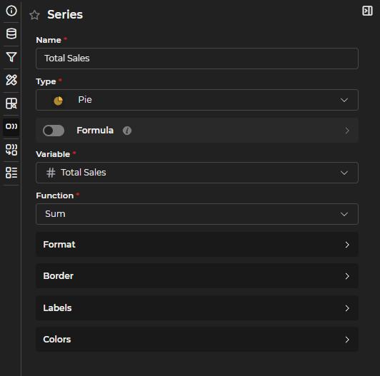
Figure 6.31: Pie Series Configuration
Donut
Donut type series are similar to pies but with a hole in the center. In this type of series, in addition to what is common with Pie type series, you can configure:
- Width of the donut: you can choose between a fixed width in pixels or a percentage of the radius.
- Totalizer: allows displaying a value in the center. The text size is a percentage value; if the size is 100, it will occupy 100% of the internal diameter of the donut.
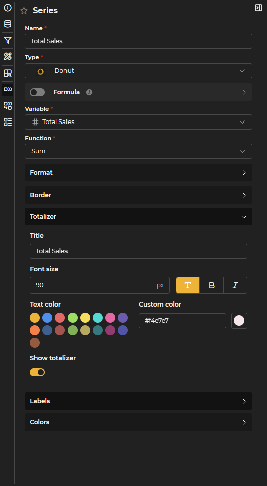
Figure 6.32: Donut Series Configuration
Heatmap
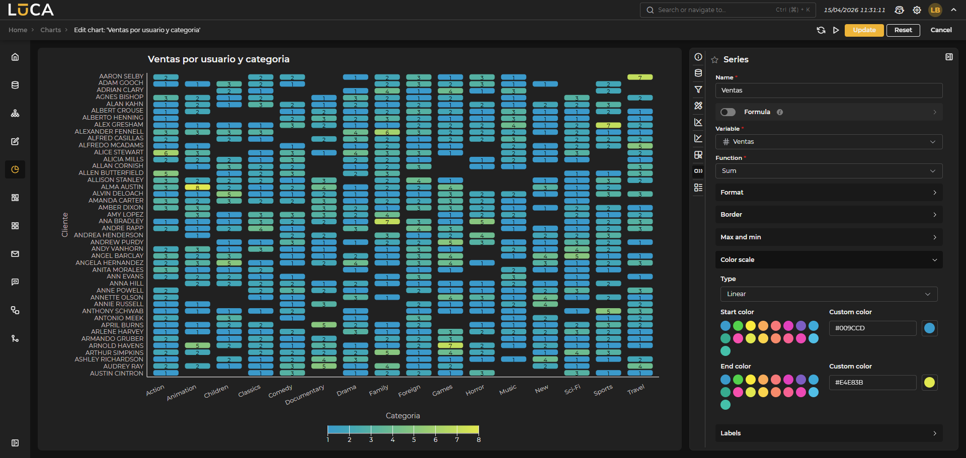 Figure 6.33: Heatmap Chart
Heatmaps allow visualizing a magnitude through colors in two dimensions. To do this, two categories must be configured, one for the X axis and another for the Y axis.

Figure 6.34: Heatmap Categories Configuration
In heatmap type series, besides the basic configuration shared by all series, you can configure the following specific options:
-
Border: You can configure the border of each box in the heatmap by assigning a color, a width, and the radius of the corners. Additionally, spacing between boxes can be added or kept together.
-
Maximum and Minimum: You can define whether to include a label indicating the maximum and minimum per row or column, indicating the color of the text and the size.
-
Labels: You can configure whether to display labels with the values for each cell or not, along with their size and color.
-
Color scale: The most important aspect of heatmaps is the color scale with which it is represented. Several options are available:
- Linear: Allows defining a start color and an end color for which a linear scale will be generated for each value.
- Sequential: Allows selecting different predefined color schemes.
- Threshold: Allows manually defining thresholds to apply specific colors or, like in the sequential, select from various color schemes.
- Quantize: Allows defining the number of partitions the scale is divided into. The cut-off values for each partition will be calculated based on the minimum and maximum value of the magnitude to be represented. For example, if 3 partitions are chosen, the minimum value of 0 and the maximum of 1000, the limits will be 333 and 666. Predefined color schemes can be applied.
- Quantile: Allows defining the number of partitions the scale is divided into. The cut-off values for each partition will be calculated so that each contains the same number of elements. For example, if 3 partitions are chosen, the limits will be calculated so that each has 33% of the samples. Predefined color schemes can be applied.
Pivot Table
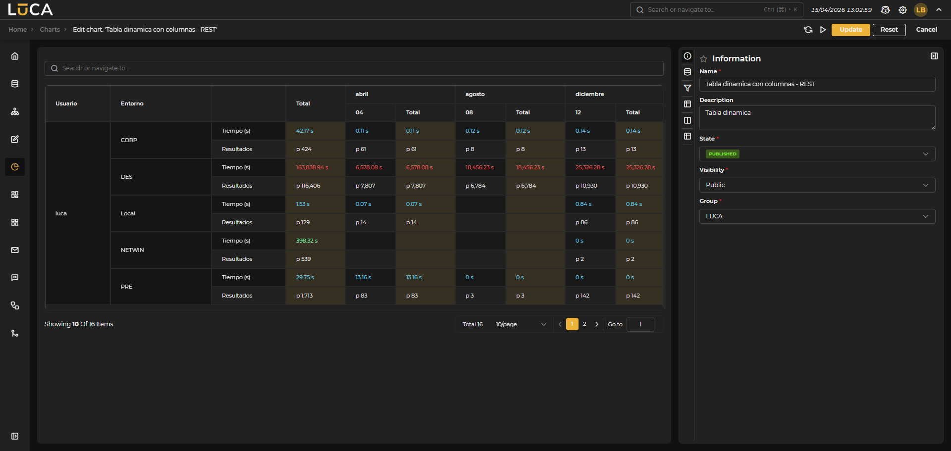 Figure 6.35: Pivot Table Chart
Pivot tables allow grouping data in table format, either by grouping rows or columns.
Rows
These indicate the groupings performed at the row level. As many as desired can be defined and configured as expandable or displayed directly by merging cells. Additionally, you can define that if the row is expandable, it will show expanded by default and you can also configure the background color.
Just like in queries, you can also define as many ranges as desired to give colors to the resulting grouped cells or rows. If the variable utilized contains ranges, these will be inherited, and you can decide whether to keep, modify, or delete them.
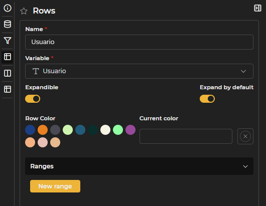
Figure 6.36: Pivot Table Rows Configuration
If there are also columns in the table, the rows cannot be expandable.
Columns
Columns define the groupings made in the columns instead of in the rows. As many as desired can also be defined, just by choosing the corresponding variable.

Figure 6.37: Pivot Table Columns Configuration
Values
Values represent the magnitudes to be shown in each cell. You must assign a name, a variable, and a function.
Just like in rows, you can add color ranges. If the variable used contains ranges, these will be inherited, and you can decide whether to keep, modify, or delete them.
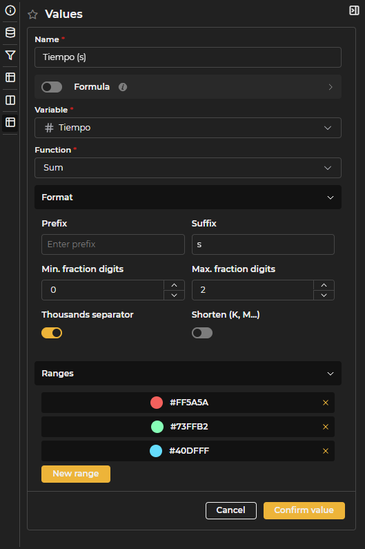
Figure 6.38: Pivot Table Values Configuration
If there are no columns configured, values will be represented as columns. When there are defined columns, values are shown as new rows for each record.
Gauge
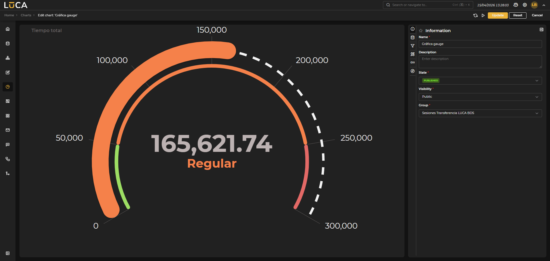 Figure 6.39: Gauge Chart
Gauge or radial meter type charts allow measuring and visualizing a current value using a semicircular scale, facilitating performance evaluation.
In this type of chart, the following options can be configured:
- Start and end angles: Indicate where the semicircle that represents the chart begins and ends.
- Minimum and maximum value: Defines the start and end of the scale to be represented.
- Color: Color of the gauge when it contains no limits. A custom color can be selected.
- Width: Thickness of the gauge. The border radius can also be configured.
- Axis: Shows the values of the scale on the gauge. The color, size, visibility, and scale (full or just limits) can be configured.
- Totalizer: Displays the current value in the center of the gauge. The color, size, and visibility can be configured.
- Limits: You can define as many limits as desired to show different scales with different colors. For each limit, configure color, label, start, end, and opacity.
Figure 6.40: Gauge Configuration
In gauges, only one series can be configured. Unlike other chart types, the Gauge series does not have additional configuration; it is sufficient to define the variable and the function to be used.
Scatter
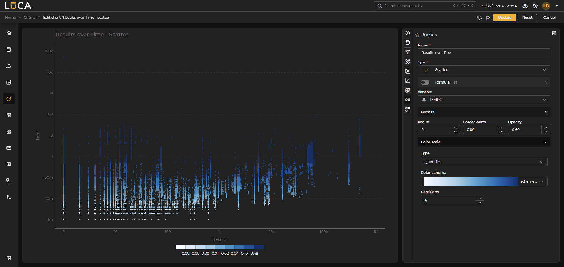 Figure 6.41: Scatter Chart
Scatter charts allow visualizing the relationship between two variables represented in Cartesian coordinates (X and Y axes).
Category Configuration
Just like in heatmap charts, two categories must be configured:
- One category for the X axis
- One category for the Y axis
Series Types
This type of chart allows creating two types of series:
Scatter Series
Represents the data as a cloud of points. The following options can be configured:
- Radius: Size of the points.
- Border width: Thickness of the outline of the points.
- Opacity: Level of transparency of the points.
- Color: Main color of the points.
- Border color: Color of the outline of the points.
- Color variable (optional): Additional variable to assign a color scale to the points.
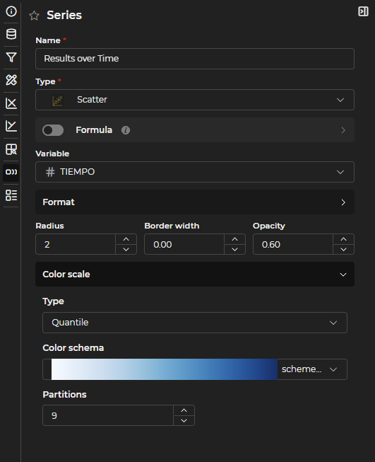
Figure 6.42: Scatter Series Configuration
Bubble Series
Represents the data as variable-sized bubbles, where the size and color of each bubble can be determined. The following options can be configured:
- Minimum radius: Minimum size of the bubbles.
- Maximum radius: Maximum size of the bubbles.
- Border width: Thickness of the bubble outline.
- Opacity: Level of transparency of the bubbles.
- Colors: Allows assigning a specific color to each category.
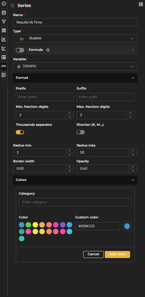
Figure 6.43: Bubble Series Configuration
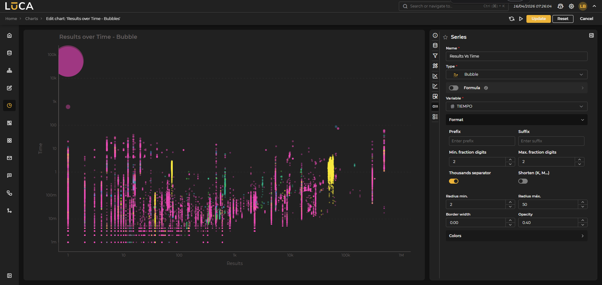 Figure 6.44: Bubble Chart
Simple
 Figure 6.45: Simple Chart
Simple charts allow representing a single value in text format. The value can be dynamically calculated through a Formula that uses other variables from the query. You can configure the color, text size, and color ranges just like in queries.
Additionally, if the Svg switch is enabled, you can write svg code and visualize it. When this option is selected, the Preview button displays a box with the generated chart at the bottom.
To include a variable in the svg code, use the following format: ${variable}
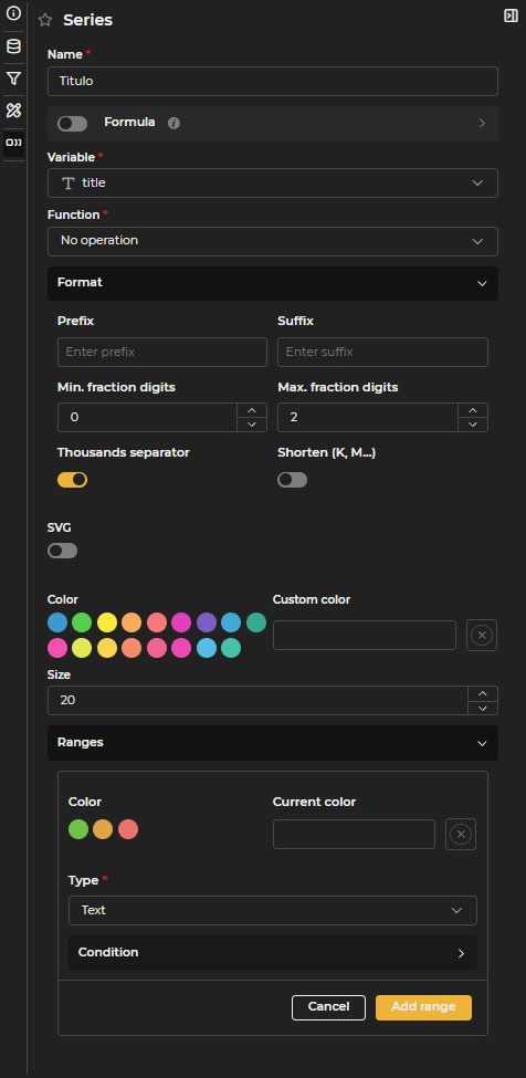
Figure 6.46: Simple Series Configuration
Html
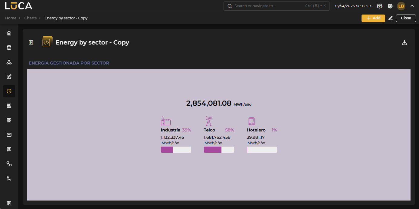 Figure 6.47: Html Chart
Html type charts allow representing data with a completely customized format.
You can use as many series as desired, previously defined, to show the information they return.
There are a series of default HTML templates that can be used. In the Template section, you can select the desired template.
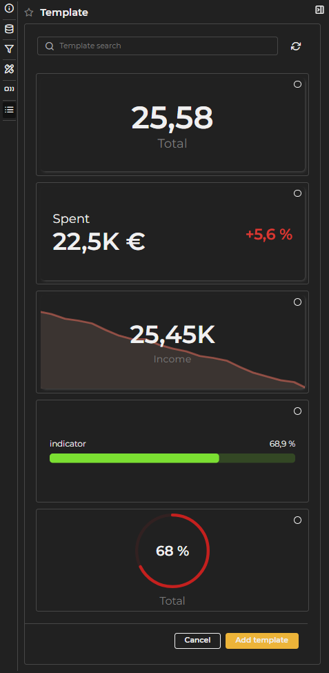
Figure 6.48: Predefined Templates
Once a template is selected, specific settings for it can be established. Depending on the chosen template, certain parameters can be configured. For example, the card template, the first and most basic one, allows modifying the background color of the variables, choosing the value to be displayed, the value color, the descriptive or displaying text, and the descriptive color.
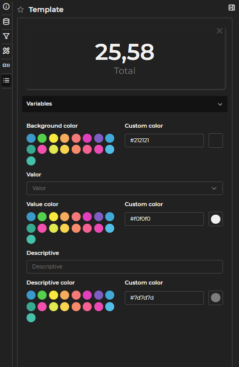
Figure 6.49: Template Variable Configuration
In the code section, the custom code is defined. You can edit the code of predefined templates; even if the template is deleted, the code remains.
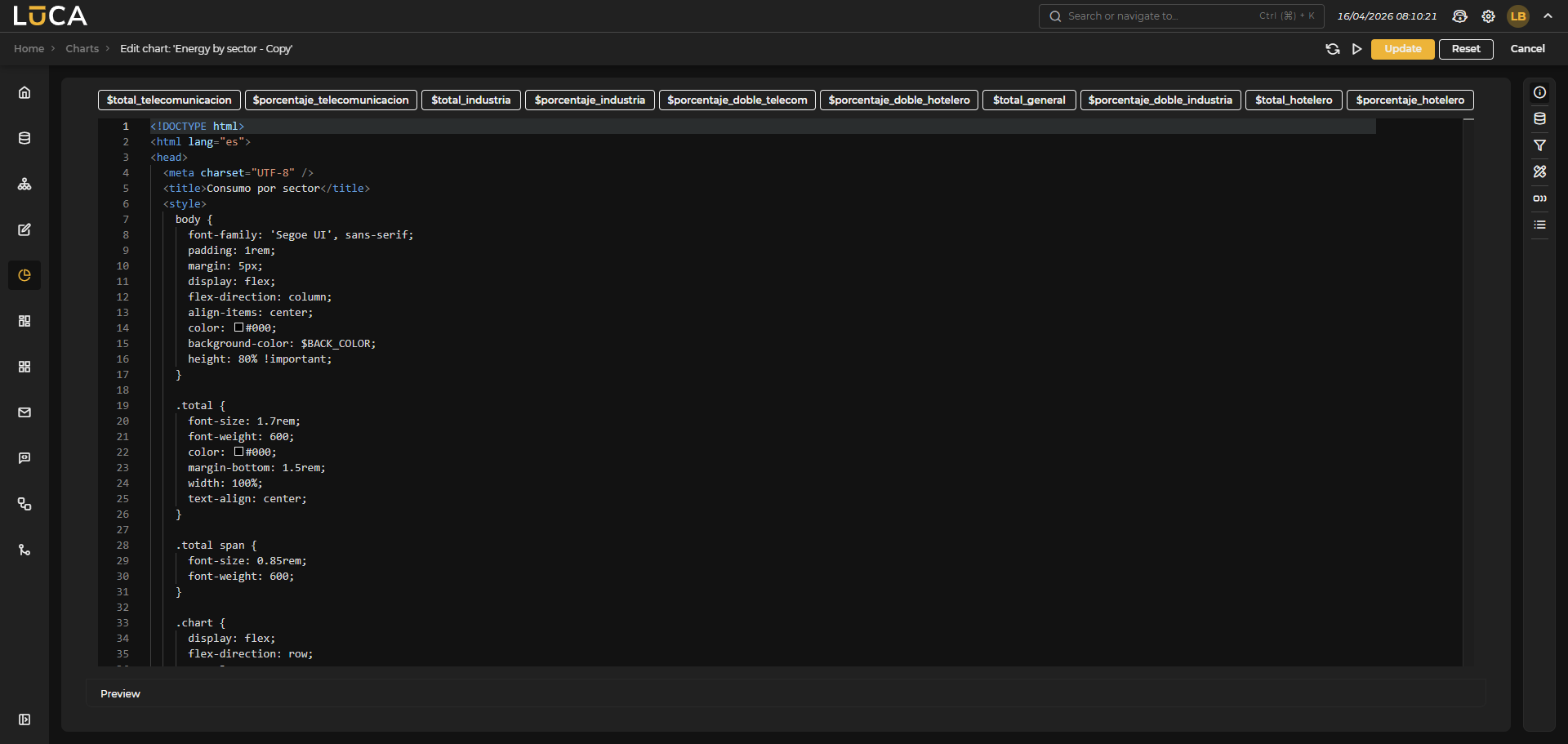 Figure 6.50: Html Configuration
At the top, the previously declared series appear, which are used in the Html through Velocity code. The upper buttons help to add the desired variable in the editor by clicking on it.
All values used in Velocity with $SERIE are of type String. If it's a numeric variable and you want to use the numeric value for a condition in an if, you can use the variable as $SERIE_value. For example:
#if($TIEMPO_value > 10) color: red #else color: green #end
Map
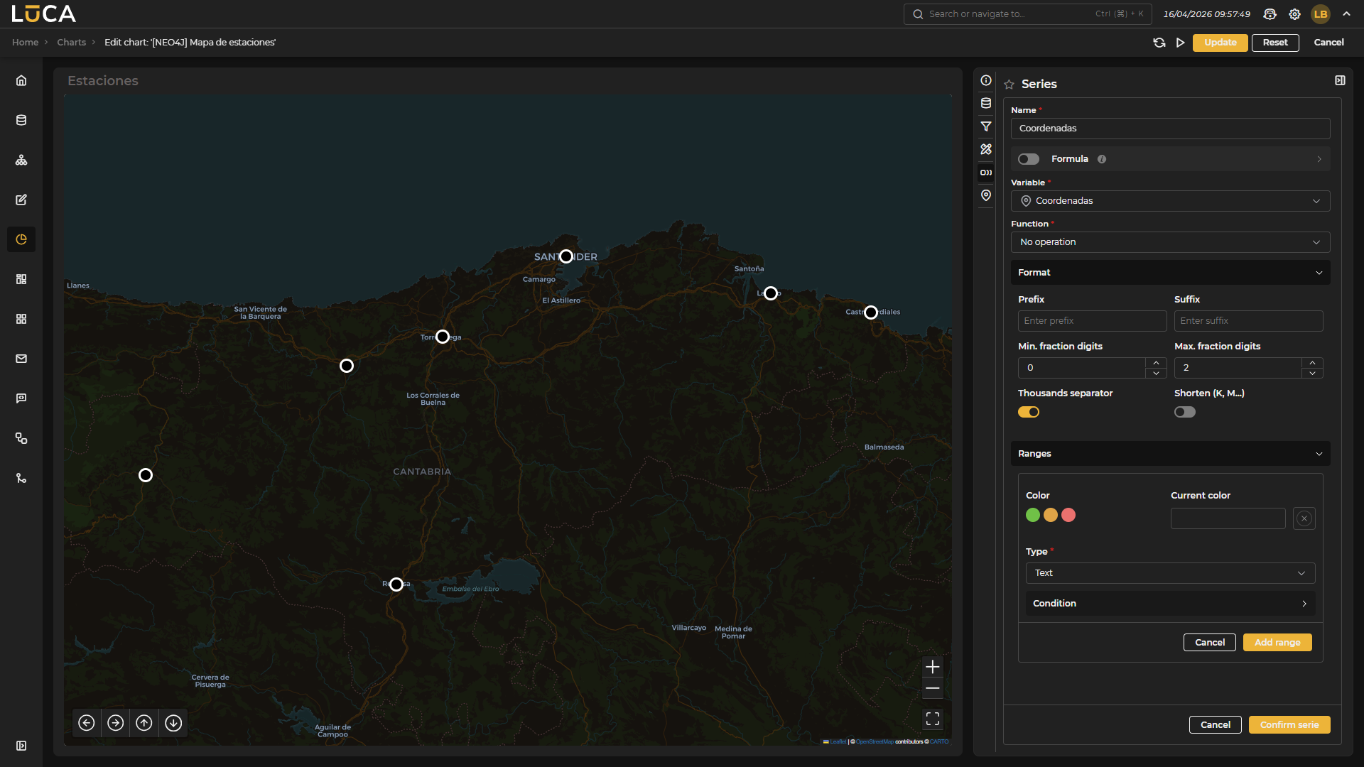 Figure 6.51: Map Chart
Map type charts allow placing markers by coordinates on an interactive map.
In the configuration of this chart, there is a new section called Map, which allows defining:
- Coordinates variable: Variable from the query that contains the exact point to be represented on the map.
- Title variable: Name that represents the label of the marker on the map.
- Zoom: Zoom level with which the map loads.
- Auto center: Activates positioning of the initial view at the center of all points.
- Marker: Configuration of the labels or markers of the various represented points. The following options can be configured:
- Color: Color of the marker. A custom color can be selected.
- Group markers: Allows grouping nearby markers on the map.
- Grouping colors: Specific configuration for small, medium, and large groups, as well as the grouping thresholds.
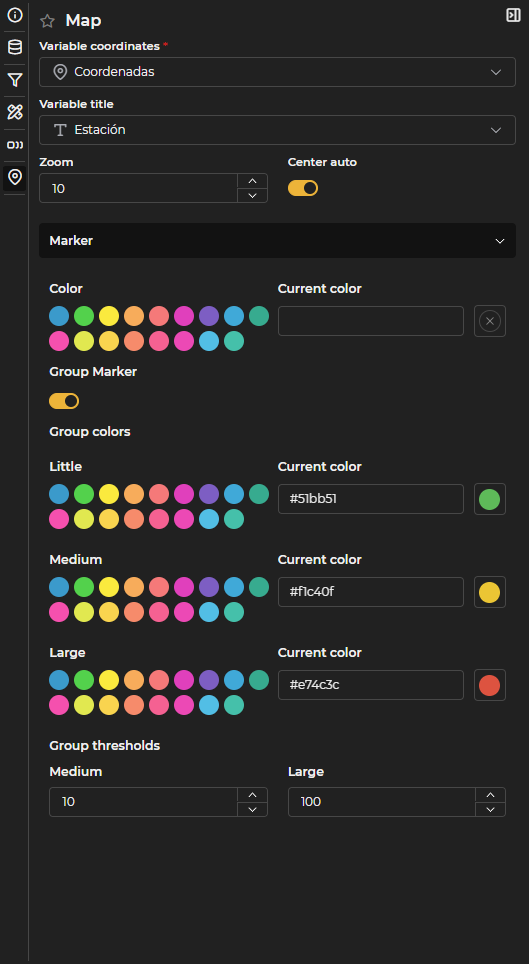
Figure 6.52: Map Configuration
You can also add as many series as desired. The information returned by the series is displayed as a tooltip when hovering over the marker. Ranges can be defined in the series to color the markers based on the value of a series.
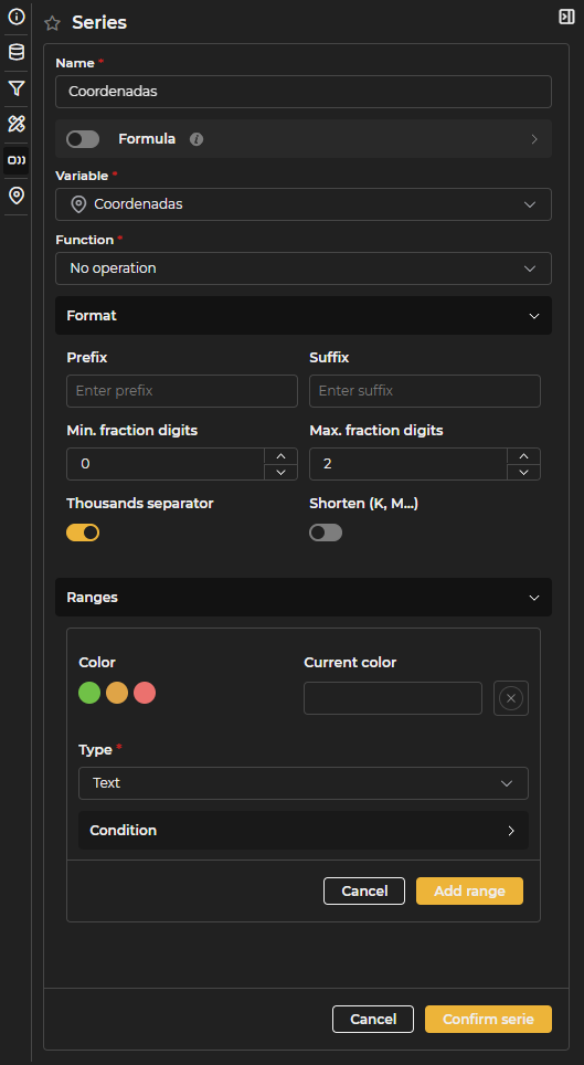
Figure 6.53: Map Series Configuration
Chart Execution
 Figure 6.54: Chart Execution
From the chart execution, the obtained results can be visualized. On the left side, there is the filter selector above the execution button. Next to the chart title is the button to collapse the filter.

Figure 6.55: Custom Filter
If the chart is a restricted public chart, the button to expand the filter will not be visible, and it can only be executed with the previously defined filters.
In the upper right section, there is a share button that offers the option to export to csv, export to png, and the link generator to create a link and share the chart.